Iterative Design – Why Playtesting Matters
I am currently working on a game called Lintrix and want to share its design process because I think it can help other with developing their games. But first a small premise explaining the game.
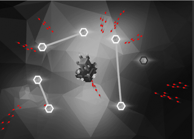
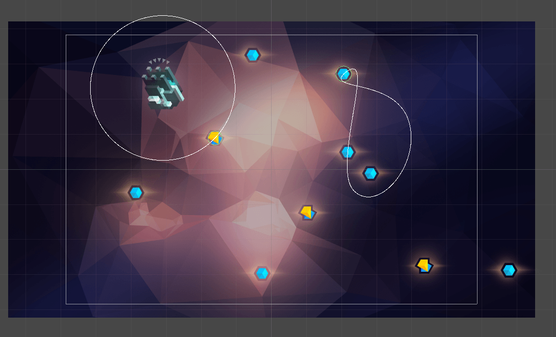
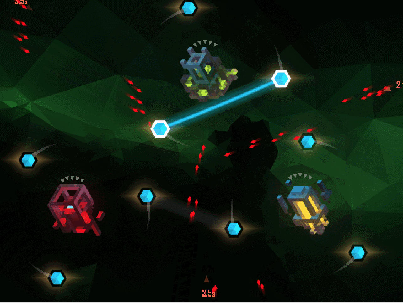
Lintrix is an action-puzzle game where you defend by creating barriers between crystals. But one crystal can sustain only one barrier and barriers cannot intersect.
Every created barrier and every missed enemy spend one energy and to complete levels perfectly you need to spend as low as possible.
There are 3 stars for each level with a unique amount of energy required.
In Lintrix, we have the same Menu that we reuse for the different states of the level. For example – Pause, Victory and Game Over states. Each state has different buttons, some of which stay the same – like “back to the map”. But some like “Resume” make sense only when you pause. Those menu screens also have other common information like the number of barriers created or missed enemies. And they share the settings screen.
Here I wanted to show how playtesting demonstrated to us that changes to the interface can lead to things we didn’t even think about.
First Iteration (Game Jam)
Idea
This was just a version for the game jam so it had bare functionality. Buttons to be able to go to the title screen, to the next level or restart the level.
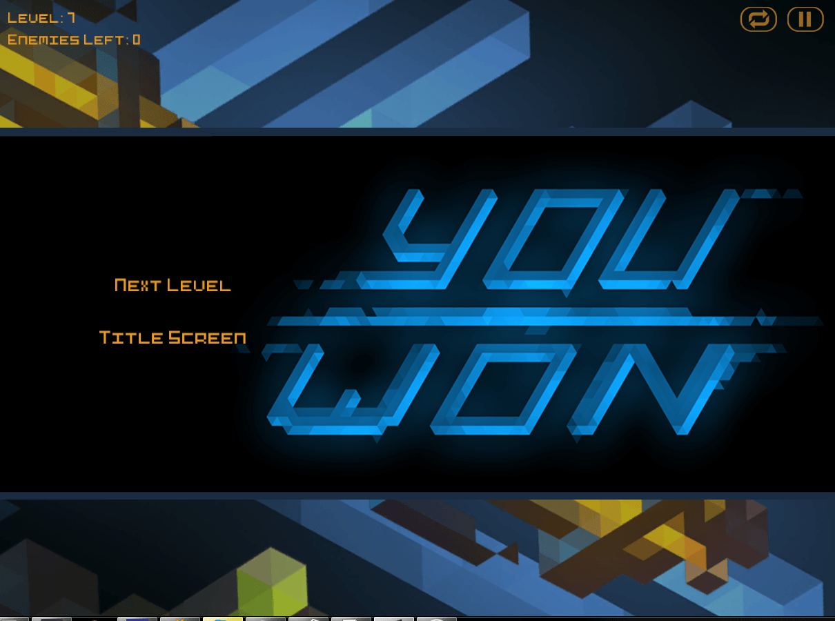
What we found out
Players were pressing on the Text on the right – i.e. “YOU WON” to go to the next level for example. Same thing for other types of this dialog. They didn’t notice it (when we asked them), but they were still doing it. This was probably due to the layout of the screen and that the buttons on the left are not that visible as the big “YOU WON” on the right.
The buttons were hard to press and players looked for some time to find the right one.
Second Iteration
Idea
The buttons were too small and not suited for mobile (we started making the game for mobile at that time) so we knew they should be redone. And not only showing buttons as text but also using icons to help understand what the button does at a glance.
We also figured that there is a “next action button” in our game for different types of this screen (Pause, Victory, Game Over) and it should always be in the same place.
For example when the player pauses the game it should be “Resume”, for the Victory screen – “Next” (this will get the player on the map and move to next level) And for the Loss of the level – the ability to restart it.
In the previous version players were pressing on “Victory”, “Pause” so we made them pressable even though the positioning of a lot of elements have changed.
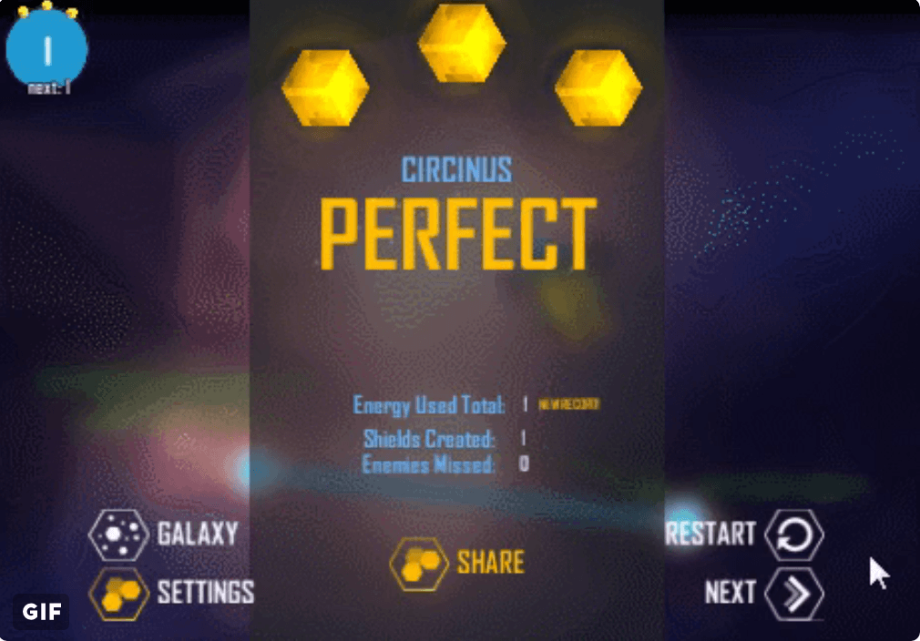
What we found out
“Next action button” worked really well, you had the most needed button always at the same place so after learning it once you can later press it without thinking about it.
We’ve redone the interface and the labels like “Victory” were no longer on the right. And So we thought players wouldn’t press them to go next, but players still did that (a lot less though) so we decided to keep this feature.
But because of the new design the eye of the player was drawn to the middle now. The buttons were on the sides so the player still searched for them at first. There also was a share button on the center that people pressed without noticing what this button is about. They thought that it was the “Next action button” to get to the next level for example. And it is the most logical place for it.
We also noticed that the buttons on the right were too small and close to each other and that may have lead to errors, more so on the smaller screens.
Third Iteration (current)
Idea
We understood that the buttons on the sides were not visible enough and players spent some time searching for them. Also, there were not that much space between buttons so the player could easily press the wrong button (not the one he intended)
Different types of this dialog had a different number of buttons and we thought the previous version was good at the time. But then we realized that we could remove some options because in certain circumstances they are actually the same thing.
For example, these are current buttons for each state (“next action button is the second one”):
- Pause Screen – “Back to the Map” / “Resume” (we removed restart because it is available from the level)
- Victory Screen – “Restart” / “Next Level” (before both “Back to the Map” and “Next Level” were on this screen and both did the same thing)
- Game Over Screen – “Back to the Map” / “Restart”
We also added numbers over the star slots that should help with the idea that you get stars based on the amount of energy you’ve spent creating barriers and missing enemies.
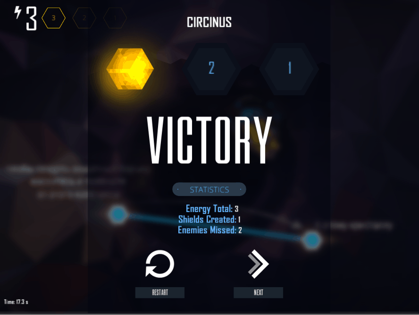
What we found out
This is the current version and not a ton of playtesting was made. But from our experience so far, I can say that it became a lot faster for the player to move to the next level when he finishes the first level. The percentage of people that get the energy system before the end of the first galaxy also increased. (but this can be due to other changes in tutorial, etc.)
(There were more smaller iterations, but I compiled them into several chunks.)
And so after a couple of iterations we have a lot more intuitive interface without big functional problems that we wouldn’t even know existed if we haven’t playtested.
Recommended read / watch:
- The Design of Everyday Things by Donald A. Norman
- Why Nathan Drake Doesn’t Need a Compass